We all experience plenty of stress in our everyday lives, often resulting from our jobs and commitments. But your home should act as a soothing oasis in the hustle and bustle of the day. And since color impacts our emotions, we can weave calm right into our home décor with the best paint colors for a stress-free environment.
Blue
Different colors possess different connotations depending on your culture. But if there’s one color almost universally associated with tranquility, stability, and calm, it’s blue. This makes sense when you consider how it feels to look up at a clear, cloudless sky. Even on a biological level, the color blue can help reduce your heart rate, which may help you sleep at night.
Green
We often associate green with some ugly emotions, like envy or infidelity. But green is also prevalent in nature. Just imagine standing in an open field or a still forest. Painting your walls green can bring this soothing, natural element into the home. A pale, tea green is light and soothing, and it can help maximize the natural light in a space.
Blush
You may have heard the phrase “seeing life through rose-colored lenses” to describe someone as optimistic and upbeat. That’s because we associate pink with calm and a reduction of aggression, so much so that holding cells in prisons are sometimes painted pink. These feelings may also extend to your interior décor if you use a pastel pink or blush color in your room.
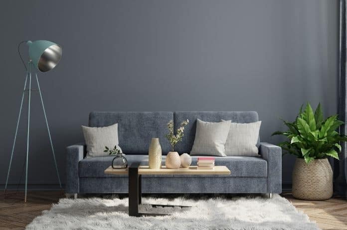
Neutrals
Neutral colors such as white, beige, and grey are common in houses. That’s because realtors tend to recommend neutral paint colors for those getting ready to move. They work nicely to depersonalize the house so potential buyers can imagine themselves living there. They also contribute to feelings of calm and reflect sunlight.
Note On Colors
Even with the best paint colors for a stress-free environment, too many colors can make a home feel stressful and chaotic. For a truly calm space, stick to three or four colors in a space at a time. Try the 60-30-10 rule. Use your main color for 60 percent of the room and a neutral for 30 percent. Implement an accent color in ten percent of the room.